I made this little video today, featuring Marion the calf.

Tuesday, August 30, 2016
Thursday, August 25, 2016
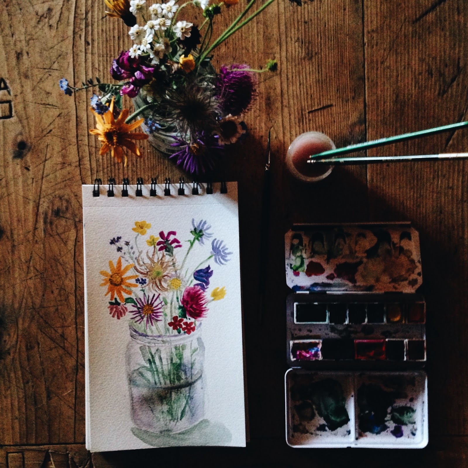
Top tips for editing phone photos

A commenter named Kate somewhat recently asked me how I edit my phone photos. (I was touched that you asked, Kate!) Many of my answers are totally conventional phone-photo wisdom, but I always like to read other people's guides, and I hope mine might be useful in the mix.
Step 1: Start with the best possible photo
- Avoid blur. I use an iPhone--a plastic iPhone 5C. It is very easy to get blurry shots on this kind of phone. Sometimes, in dim conditions, I really like the blurriness--here's an example. (My girlfriend's higher-quality iPhone doesn't blur like this, even when you want it to.) But most of the time I try to avoid blurriness by tapping on the center of the subject I want to focus on, before I take the shot. This is helpful when I want to photograph a scene with some deep shadows and some bright areas. If you tap the area you want the iPhone to focus on, it'll adjust the shutter speed. Then I have to remember to hold the phone still...it's not always easy!
- Don't zoom too much. You can always crop later. My phone doesn't have a very high tolerance for zoom. Things start to get grainy pretty much immediately.
- Make sure your lens is clean. Mine always gets dusty in my bag and it leads to "soft-focus"-looking photos. So I try to wipe it off, just with my shirt or whatever, before taking any photos.
- Don't cut the photo perfectly in half with the horizon line--choose which is more interesting, the sky or the ground, and fill two thirds or more of the frame with that. Example.
- Bonus tip about light contrast: I only recently learned this and I love it! If you're photographing a subject in a scene with a background of varying light, try to get your subject in the brightest area. Here's my example. The street would still be beautiful if Eve were over towards the left, but getting her right in the brightest area of light gives the photo more impact.

Step 2: VSCOcam
- VSCOcam is a free app I use for all my photos. The Instagram filters can be a little candy-colored and cheap-looking to me. The VSCOcam filters are subtler. I don't use the social network component of the app, but just edit photos, download them to my camera roll again, and upload them to Insta from there.
- Before I filter the photo, I do a lot of little changes. I tend to darken the photo, add a little contrast, sharpen a little, and add a little bit of the "vignette" effect. I also tend to add a click of warmth, away from blue and towards yellow, and click the tint once away from green and towards pink. My phone seems to err, in raw photos, on the side of bright, low-contrast, blue-toned images, and all these little changes tend to bring things back to how they actually looked.
- If the photo has some areas that are super-dark or super-bright, I often use "shadows save" and "highlights save." These can very quickly get your photos looking washed out or dull, so I counter with a little more contrast and sharpness. It's hard to hit the balance just right but "shadows save" and "highlights save" have helped me with images like this. On rare occasions I'll download photos I took with my high-quality digital camera, and one huge difference between those photos and iPhone photos is that the digital ones have a lot more wiggle room on shadows/highlights--they preserve much more detail.
- I downloaded all of VSCOcam's free filters. The ones I use most tend to be A6 and HB2. HB2 in particular can darken my photos too much, so I often click its power down somewhat. After filtering I might adjust tone and exposure again. I might even reduce saturation. I don't want my photos to look overfiltered.

Step 3: Instagram
- My favorite thing on Instagram is "Lux." This is the little sunshine-icon at the top, the first thing you can do to your photos when you upload them. It does a lot of things at once: saves shadows, saves highlights, adds sharpness, and adds saturation. The people at Instagram engineered Lux just right and it usually gives my photos an extra pop of clarity, which I love.
- Very rarely I'll add a little bit of Instagram filtering, toned way down, onto my photos. Just a couple clicks of "Gingham" can make the whites more vivid and true when I'm editing a photo of a book or a drawing.
- I try (and sometimes fail) to vary the composition of photos I post, so that my feed looks better as a whole. If I just posted a photo of Central Park greenery, I'll try not to post a leafy forest immediately after. Or if I just took a photo of books on a white background I'll avoid another white background in the next post.
- Serious Instagram people talk about how you want your whole feed to look cohesive. I have trouble sticking to just one color palette or type of filtering, because it always seems to depend on the photo, and I take photos in so many contexts--on the streets, in my apartment, in the Italian alps. And then I do so many random activities. I still need to figure out how much variety I'm willing to sacrifice in the name of cohesiveness.
- Some of my favorite Instagram accounts are listed here!


As always, thank you all so much for reading--I am so, so grateful to everyone who has left a comment or sent me a DM or email about this blog or my work. If you ever want to hear my thoughts (meandering though they are) about any topic please let me know and I will try to do a post on it!
PS Here are all the instagram-related posts on this blog.
Monday, August 22, 2016
Phone photos from Azienda Agricola Arpisson


you can read more about the two-week trip i took to this dairy farm in the italian alps here, and here are all my posts about wwoofing (volunteering on organic farms)


kira the wonderfully smart farm dog :)


Friday, August 12, 2016


Subscribe to:
Posts (Atom)